.jpg)
Too many colours can hurt the eyes; competing for attention, while too few can make the space feel flat and lifeless. But three colours, only? Yes, because three creates a perfect balance.
Have you ever been in a fix and had to search for:
- How to choose a colour palette for a room.
- How many colours should be in a room?
- How to make my room decor look cohesive and balanced.
- How to successfully decorate a room with just a few colours.
Why the 3-Colour Rule Works
Using only three colours helps your room feel organised and balanced. It also shows:
Clarity: The space feels clean and easy to understand. Your eye isn’t overwhelmed by too many competing tones.
Visual rhythm: When colours repeat in different areas, your eye moves smoothly around the room instead of jumping from one random colour to another.
Cohesion: Everything feels nicely connected with the furniture, decor, and textiles, and they all look like they belong together.
Intentional design: The room looks planned. Even simple spaces feel more polished when the colour palette is controlled.
With only three dominant colours, your room will not look like it’s randomly decorated. It will look and feel perfectly planned.
Step 1: Choose Your Base Colour (60%)
Your base colour is the foundation of your colour scheme and should cover roughly 60% of the room. It usually appears in the following places:- Walls
- Large furniture pieces
- Area rugs
- Floor finish
- Warm white
- Soft beige
- Light grey
- Taupe
- Soft greige (a combination of beige and grey)
Step 2: Select Your Secondary Colour (30%)
Your secondary colour supports the base and adds personality. It usually appears in:- Upholstery
- Curtains
- Accent chairs
- Larger decor pieces
- Soft brown
- Muted sage
- Charcoal
- Dusty blue
Step 3: Add One Accent Colour (10%)
Your accent colour may be the smallest percentage, but it must have the biggest impact. The pieces best suited for accent colours are:- Cushions
- Artwork
- Vases
- Lamps
- Books
- Small decor pieces
- Base: Warm white
- Secondary: Soft brown
- Accent: Muted blue
The key rule:
Repeat your accent colour at least three times in different parts of the room. Repetition makes it feel intentional, and not just random.Free Room Colour Palette Tool
Find your colour palette with the free tool below. Use it to find your personalised three-colour scheme for your room/space, in under sixty seconds.
Find Your Room Colour Palette
Answer four quick questions to get your personalised 3-colour scheme.
Which room are you decorating?
How much natural light does the room get?
What feeling do you want the room to have?
How big is the room?
Where to use each colour
Your saved palettes
How Do You Know If Your Room Has Too Many Colours?
You definitely have a colour riot in your room if:
- Every cushion is a different colour.
- Art introduces new tones that don’t repeat.
- Decor was bought individually, without a palette plan.
- Your eyes don’t know where to rest.
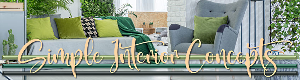
Real Example of a Living Room Reset Using Only 3 Colours
Imagine a small living room with:
- A grey sofa
- Mustard cushions
- Blue throws
- Green plant pots
- Pink artwork
- A brown coffee table
- A beige area rug
Base: Warm beige (walls and area rug).
Secondary: Soft brown (coffee table and chair).
Accent: Muted blue (cushions, artwork, and small decor items).
When you remove the mustard cushions and pink artwork:
- The room will feel calmer.
- The eye moves smoothly.
- Everything connects together.
Warm vs Cool Hues: Why Undertones Matter
One common mistake among decorating homeowners is mixing warm and cool tones unintentionally. Warm tones include:
- Cream
- Beige
- Warm wood
- Terracotta
- Blue-grey
- Crisp white
- Charcoal
- True grey
What About Patterns?
You can absolutely use patterns as long as they include at least one of your three chosen colours. For example, a patterned cushion that contains beige, brown, and blue fits perfectly into the colour palette. Patterns should reinforce your colour choices, not introduce new dominant tones.
Can You Use More Than Three Colours?
Yes, you can, but they must be carefully introduced. You can include:
- Wood tones
- Greenery
- Metallics
A Quick 5-Minute Colour Audit
Stand in your room and list the visible dominant colours. Ask yourself if:
- You see more than three strong tones.
- One colour dominates too much.
- The accent colour is repeated at least three times.
- Your chosen colours share similar undertones.
If the answer feels unclear, then your palette likely needs simplifying.
Why This Method Works in Small Spaces
Small rooms (especially) benefit from limited colour palettes. Too many colours, small spaces will feel cluttered, but with three, and in the right ratio, you will achieve visual continuity, beautiful calmness, and a more spacious look.
So, if you find that your small living room looks/feels busy, simplify your palette to instantly improve it.
Would You Like Some Help Choosing Your 3-Colour Palette?
If you would like a tool that will help you:
- Identify a base colour.
- Select a balanced secondary colour.
- Choose and repeat your accent colour with intention.
Final Thoughts
Structure creates calm, and calm is what you need to make your home feel comforting and aesthetically appealing.
Related Posts:
No comments:
Post a Comment
Note: Only a member of this blog may post a comment.